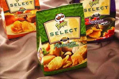
According to John Recker, LPK’s executive vice president and chief strategy officer, the switch from a traditional, rigid form to a more organic, high-quality package with a sheen to it is in keeping with consumer expectations of gourmet products. To further strengthen the brand communication, the Select name is set in a shield containing an image from a destination that helps to tell the story of the different Select flavors, thereby enhancing the customer’s emotional connection with the product. “Gourmet snacks are a new area for Pringles,” says Recker. “The photography is of fresh and natural ingredients, appealing to consumers that have an elevated expectation of indulgence and taste.”
All bag material is gravure-printed by Sonoco Flexible Packaging (www.sonoco.com) on a foil lamination using seven colors.
Available in 5.5- and 8-oz bags, Pringles Select comes in four flavors: Cinnamon Sweet Potato, Parmesan Garlic, Sun Dried Tomato, and Szechuan Barbecue. Each flavor is distinguished by a different color: “We leveraged the idea that shoppers often shop by color,” says Recker. “This is an impulse category, so you need to leverage design as a navigation tool so shoppers can find their particular product and/or flavor very quickly.”